
In The Next Big Thing In School Improvement (2021), Becky Allen, Matthew Evans and Ben White note that various waves have washed through English schools in the past twenty years. These include the Differentiation wave in the 2000s and the recent Curriculum wave. Inbetween we saw a data wave, which peaked in the mid-2010s. The data wave has been receding. Are there signs that it may be about to return?
Ofsted inspections have used statutory data as ‘a starting point for inspection’ since the days of PANDAs, RAISEOnline and the Ofsted Schools Data Dashboard – all now superseded by the annual Inspection Data Summary Report (IDSR). The IDSR has changed over the years, starting as a 15-20 page document in the mid-2010s, before thinning down to around 10 pages in 2024-25.
The latest iteration of the IDSR (published late 2025) is substantially different to its predecessors, as is the 2025 Ofsted Inspection Framework. Both the new IDSR and the new Framework present fresh challenges, as schools get to grips with the different ways in which these important documents are likely to be interpreted and used to hold schools to account.
Interpreting school statutory data is always somewhat tricky, as the potential for misdirection is ever present. This is a particular issue in Primary Schools, with their relatively small cohorts, which often have vastly different compositions from year to year.
This presents particular challenges for Senior Leadership Teams and Governors when it comes to interpreting data. The IDSR is an attempt to help schools and those inspecting them to have some common understanding of the differences between a school (and smaller subsets of its population) and the national picture.
Let’s look at a couple of areas which might cause issues if schools allow them to.
1) ‘Close to Average’
The latest iteration of the IDSR calculates whether any given data point is ‘close to average’, or whether it is above or below this range. This represented by this graph in the IDSR guidance:
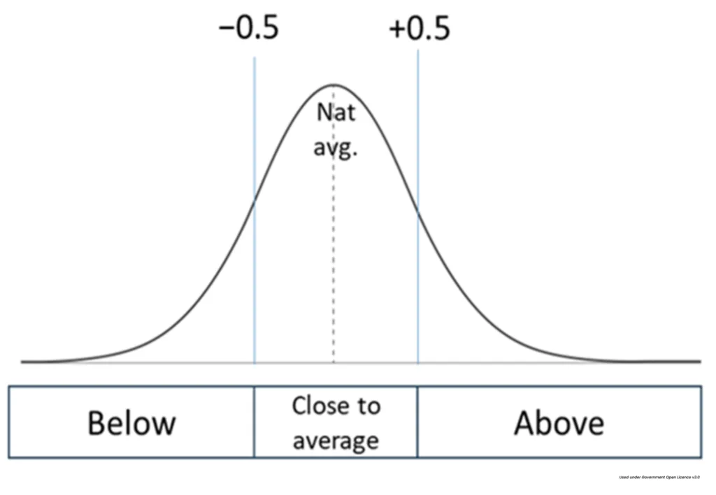
Where data is roughly normally distributed – i.e. most results are clustered around the mean, with smooth tails on either side – the idea of ‘close to average’ would seem to make some sense, on the surface at least.
But is this range (-0.5 to 0.5 standard deviations from the mean) really ‘close to average’? Statistically, this would represent 38% of all observations, were the data normally distributed. This would mean that 62% of observations were regarded as somewhat unusual – certainly not average. And whilst an observation above the 70th percentile being regarded as ‘above average’ might please some, observations below the 30th percentile being regarded as ‘below average’ might frustrate others, particularly if the data was clustered close the mean and small differences were presented in a way which might be misconstrued.
2) Non-normal distributions
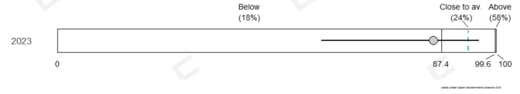
The IDSR‘s indication of being ‘above average’ doesn’t really work if there is a substantial negative skew combined with a clear ceiling effect (i.e. when most data points are close to the maximum). This is because the schools held to be ‘above average’ have, in effect, 100% of pupils attaining a particular standard.
Those near the national mean of 93% of ‘High prior attainers in Reading, writing and mathematics reaching expected standard’ (the data graphed above), who may have just one or two pupils not hitting the mark, are held to be ‘average’ largely because of the limitations in the underlying data.
3) Disadvantage gaps
The gap between pupils placed into the category of ‘Disadvantaged’, itself a problematic term, and those who are not in this category, is clearly an area of focus for the government. Nationally, those who receive the Pupil Premium (the bulk of those deemed Disadvantaged) do not compare favourably to those who do not. Whilst those in education may not wish this to be the case, the data shows that it is, and that it has been in nearly every set of national data we have.
This is further complicated because schools are complex, with differences between class, cohorts, pupils and more. What is true at a national level may not be true at a local level. Pupils receiving the Pupil Premium in different parts of the country are different to each other, making comparisons difficult.
Governments have attempted to close the gap, or to narrow the gap, at a national level. This is clearly extremely difficult, as data over many years shows repeatedly. Creating metrics which attempt to summarise the gap is also complex.
The IDSR uses fairly simple metrics which may unwittingly misdirect those attempting to interpret the data it presents, if the local and national pictures are not well understood.
Is this school disadvantage gap good compared to other schools, or not? There is clearly a gap between the school’s disadvantaged pupils and the ‘National non-disadvantaged score’, but how does this compare?
Whereas the School disadvantage gap compares the school to the national non-disadvantaged score, earlier in the IDSR a school’s FSM6 percentage is compared to the local area, without detailing the national picture.
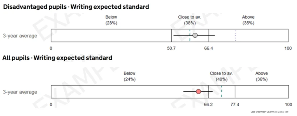
The national percentage of pupils reaching the expected standard in Writing is much lower for Disadvantaged pupils (57.55%) than it is for All Pupils (71.8%). This is much lower again than the national percentage for non-disadvantaged pupils (indicated by the dotted vertical line in the disadvantaged pupil bar above), which is higher than the highest ‘close to average’ score for All Pupils.
Is the tide turning?
The data wave caused issues in schools because it seemed almost impossible to prevent it from taking up time and effort which could be spent better elsewhere. Thankfully, those holding schools to account are working to a tighter brief when it comes to using data as a sign post.
The key, as always, will be to ensure that someone in school understands what the data suggests, what Inspectors might think, and what your understanding of the limitations of the data and your knowledge of your school tell you.
The next few months will be extremely interesting as we begin to see whether schools can hold back the tide.
Insight are back on the road –
have a look at our latest events here.
Leave a Reply